Nivel
- Category Development
- Client Webflow
- Start Date 23 January 2021
- Handover 05 March 2021

Build, streamline and evolve together with solution
Always ready to push the boundaries, especially when it comes to our own platform, Our analytical eye to create a site that was visually engaging and also optimised for maximum performance. It also perfectly reflects the journey to help it tell a story to increase its understanding and drive action. To create a site that was visually engaging for maximum performance.
- + Brand Development
- + UX/UI Design
- + Front-end Development
- + Copywriting
- + Shopify Development

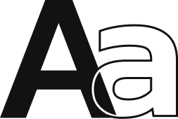
Visual and typograpy hierarchy
Visual hierarchy is the principle of arranging elements to show their order of importance. Designers structure visual characteristics—e.g., menu icons—so users can understand information easily. By laying out elements logically and strategically, designers influence users’ perceptions and guide them to desired actions. Users notice larger elements more easily can convert.

- regular This is text message
- Medium Medium typography
- SemiBold Just Amazing
- Blod Awesome


For those of us who are blessed with good sight. So we seldom consider it. That’s why going off to investigate the whys and hows involved is a little like trying to get behind the wind


